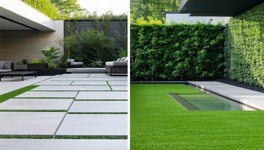
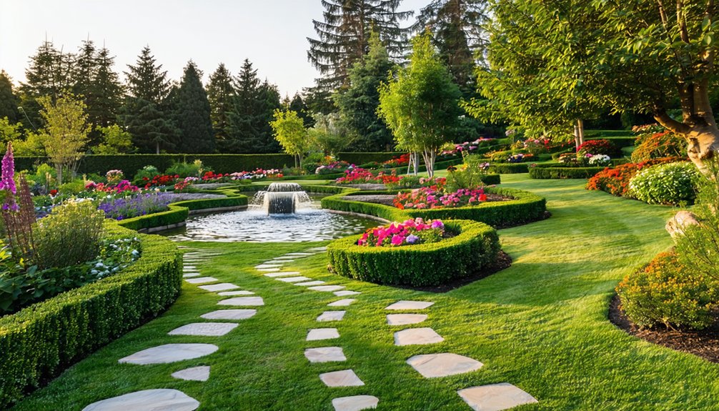
Creating focal points and achieving color harmony are fundamental to effective garden design. These elements guide the viewer’s eye and establish a sense of balance within the landscape. Strategic placement of structural features and thoughtful color choices can transform an ordinary garden into a cohesive and visually engaging space. However, mastering this balance requires understanding both artistic principles and practical techniques that often go unnoticed at first glance.
Key Takeaways
- Use structural features or unique plants as focal points to guide the viewer’s eye and create visual interest in garden design.
- Apply complementary and analogous color schemes to enhance vibrancy and maintain a balanced, harmonious plant palette.
- Position focal points along natural sightlines, pathways, or elevated areas following the rule of thirds for balanced spatial perception.
- Integrate hardscape elements like pathways, sculptures, and lighting to anchor focal points and emphasize garden zones throughout seasons.
- Balance warm and cool tones evenly, ensure seasonal bloom variation, and avoid color clustering to sustain year-round visual harmony.
Understanding the Role of Focal Points in Garden Design
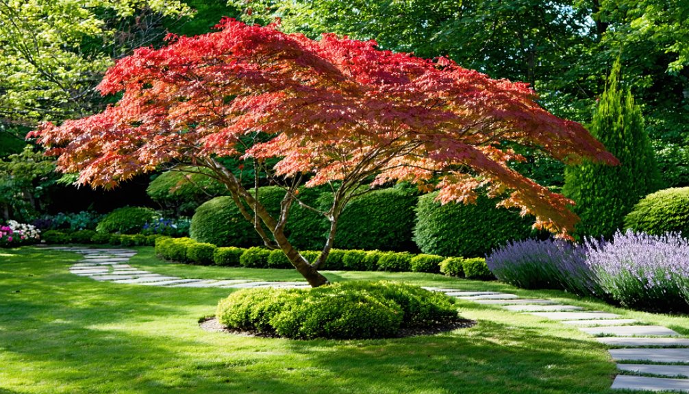
Although gardens can feature numerous elements, focal points serve as essential anchors that guide the viewer’s eye and organize the overall design.
In garden design, focal points create visual interest by providing a clear destination within the landscape, helping to balance and unify diverse components. They play a critical role in landscape design by establishing hierarchy and directing movement through the space.
Effective focal points prevent the garden from appearing chaotic or overwhelming, allowing viewers to appreciate individual features in context.
By strategically positioning focal points, designers enhance spatial perception and emphasize particular areas.
Understanding their role enables a cohesive garden design where form and function integrate seamlessly, ultimately elevating the aesthetic and experiential quality of outdoor environments.
Selecting the Right Elements for Eye-Catching Focal Points
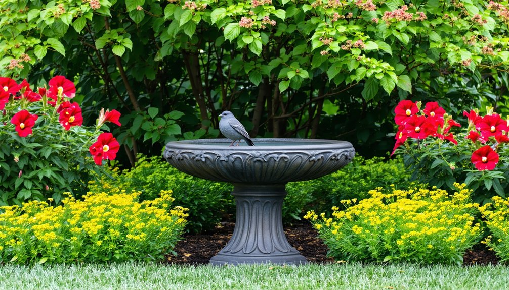
When choosing elements for focal points, their ability to capture attention and complement the garden’s overall theme is paramount. Effective focal points balance boldness with cohesion, enhancing color harmony while drawing the eye.
Essential gardening tips highlight three key elements for selection:
- Structural Features: Sculptures, trellises, or water elements provide strong visual anchors that contrast with surrounding greenery.
- Plant Specimens: Unique plants with striking foliage or vibrant blooms offer natural focal points that reinforce the garden’s color palette.
- Lighting: Strategic illumination accentuates focal points during evening hours, adding depth and interest.
Selecting these elements with regard to color harmony ensures focal points integrate seamlessly, creating a unified yet dynamic garden environment.
Techniques for Positioning Focal Points Effectively
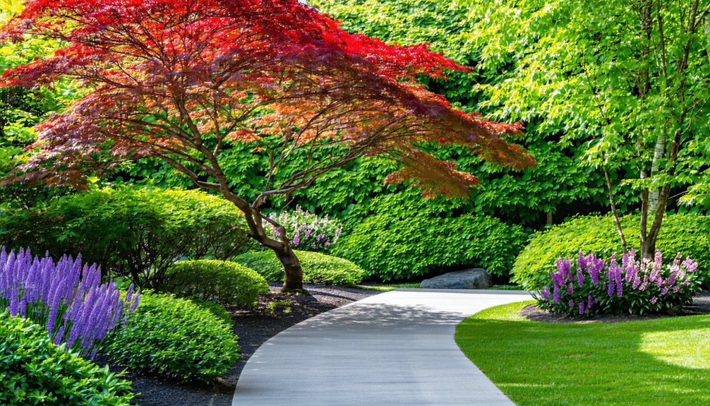
Positioning focal points strategically directs visual flow and enhances the garden’s overall composition. Effective placement often follows the rule of thirds, situating key elements off-center to create balance without rigidity.
Aligning focal points along natural sightlines or pathways guides visitors’ eyes smoothly through the space. Elevation changes, such as raised planters or sculptures on pedestals, can emphasize focal points and increase visibility.
Consideration of surrounding elements ensures that focal points stand out without overwhelming adjacent features. Layering with contrasting textures or shapes further defines the focal area.
Additionally, spacing focal points to avoid visual clutter maintains clarity and allows each element to command attention individually. These techniques collectively create engaging, cohesive garden designs that invite exploration and visual interest.
Exploring Color Theory for Garden Harmony
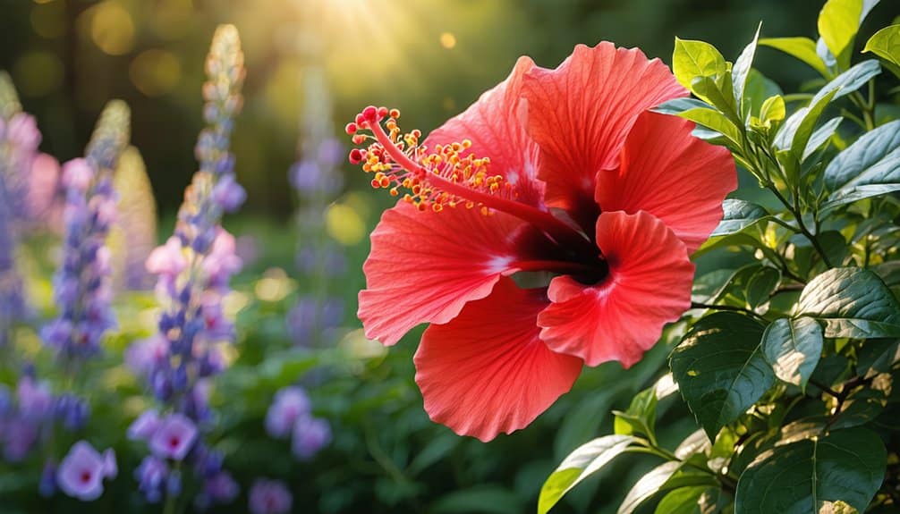
Color theory plays a crucial role in achieving harmony within garden design by guiding the use of primary and secondary colors.
Understanding how these colors interact allows for the creation of visually balanced spaces.
Complementary color schemes, which pair colors opposite each other on the color wheel, enhance focal points and unify the garden’s overall aesthetic.
Primary and Secondary Colors
The foundation of garden harmony often lies in understanding primary and secondary colors, which serve as the building blocks of color theory.
Primary colors—red, blue, and yellow—cannot be created by mixing other colors. They form the basis for all other hues in garden palettes.
Secondary colors—green, orange, and purple—result from mixing two primary colors. Recognizing these colors aids gardeners in creating balanced and visually appealing spaces.
Key points include:
- Primary colors provide bold, vivid focal points that draw attention.
- Secondary colors offer softer transitions and blend naturally with primary colors.
- Combining primary and secondary colors thoughtfully enhances depth and unity in garden design.
This foundational knowledge supports subsequent exploration of more complex color relationships.
Complementary Color Schemes
Although complementary colors sit opposite each other on the color wheel, their pairing creates dynamic contrast and visual interest in garden design. This scheme emphasizes balance by juxtaposing hues like red and green or blue and orange, intensifying each color’s vibrancy. Used strategically, complementary colors can establish striking focal points that draw attention without overwhelming the viewer. Gardeners must consider saturation and proportion to maintain harmony and avoid visual chaos. The following table outlines common complementary pairs, their psychological effects, and garden examples:
| Complementary Pair | Psychological Effect | Garden Example |
|---|---|---|
| Red & Green | Energy and renewal | Red roses with green foliage |
| Blue & Orange | Calmness and enthusiasm | Blue hydrangeas with orange marigolds |
| Yellow & Purple | Happiness and creativity | Yellow tulips with purple irises |
Combining Plant Colors for a Balanced Garden Palette
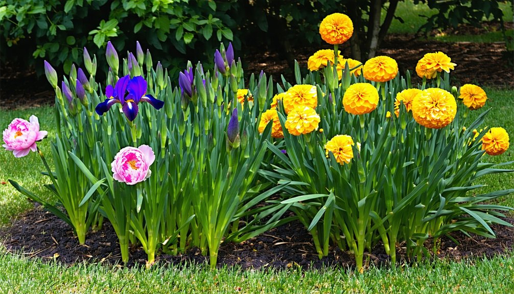
Combining plant colors effectively requires selecting complementary hues that enhance each other’s vibrancy.
Utilizing analogous color schemes can create a harmonious and cohesive look within the garden.
Additionally, balancing warm and cool tones helps achieve visual stability and interest.
Choosing Complementary Plant Colors
Successful garden design depends heavily on the careful selection of plant colors that complement each other.
Complementary colors, positioned opposite each other on the color wheel, create vibrant contrasts that energize a garden’s visual appeal.
When choosing complementary plant colors, designers should consider:
- Color Intensity: Pairing bold colors with softer tones prevents overwhelming the senses and maintains balance.
- Seasonal Variation: Selecting plants that bloom in complementary hues during the same season ensures consistent visual harmony.
- Foliage Texture and Color: Incorporating foliage with subtle shades or variegation can soften contrasts and unify the palette.
Using Analogous Color Schemes
While complementary colors emphasize contrast and vibrancy, analogous color schemes focus on harmony by using colors adjacent to each other on the color wheel. This approach creates a serene and cohesive garden palette, blending hues such as blue, blue-green, and green for a soothing effect. Analogous schemes reduce visual tension, making them ideal for spaces meant to evoke calmness. Selecting plants with flowers or foliage in these related colors ensures smooth transitions and depth without overwhelming the viewer.
| Color Group | Example Plants | Effect in Garden |
|---|---|---|
| Red, Red-Orange, Orange | Red Salvia, Marigold | Warmth and subtle energy |
| Blue, Blue-Green, Green | Blue Fescue, Hostas | Cool, calming atmosphere |
| Yellow, Yellow-Green, Green | Forsythia, Boxwood | Freshness and vitality |
| Purple, Blue-Purple, Blue | Lavender, Catmint | Elegant and restful |
Balancing Warm and Cool Tones
Although warm and cool tones each bring distinct qualities to a garden, their careful balance creates a dynamic yet harmonious visual experience.
Warm colors, such as reds, oranges, and yellows, evoke energy and draw attention, while cool colors like blues, greens, and purples provide calm and depth.
Combining these tones thoughtfully ensures neither overpowers the other.
Key strategies for balancing warm and cool tones include:
- Contrast and Transition: Use cool-toned plants as a backdrop to highlight warm focal points, creating clear visual layers.
- Equal Distribution: Spread warm and cool colors evenly throughout the garden to maintain equilibrium and prevent color clustering.
- Seasonal Variation: Incorporate plants with varying bloom times and foliage colors to sustain balance year-round.
This approach fosters a visually engaging and balanced garden palette.
Using Contrast and Complementary Colors to Enhance Visual Interest
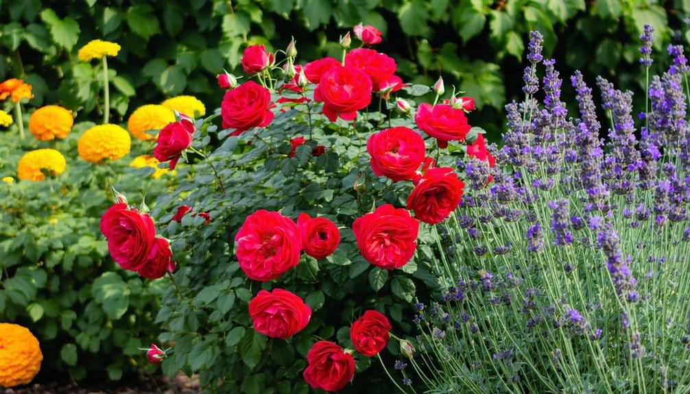
When contrast and complementary colors are skillfully applied, they create dynamic visual interest that draws the eye and defines focal points within a garden.
The use of contrasting hues—such as pairing deep purples with bright yellows—enhances depth and emphasizes specific areas, encouraging viewers to explore the space.
Complementary colors, found opposite each other on the color wheel, naturally intensify each other’s vibrancy, making plant groupings or features stand out without overwhelming the overall design.
This approach also helps balance the visual weight across the garden, preventing any single element from feeling isolated.
Integrating Hardscape Features to Support Color and Focus
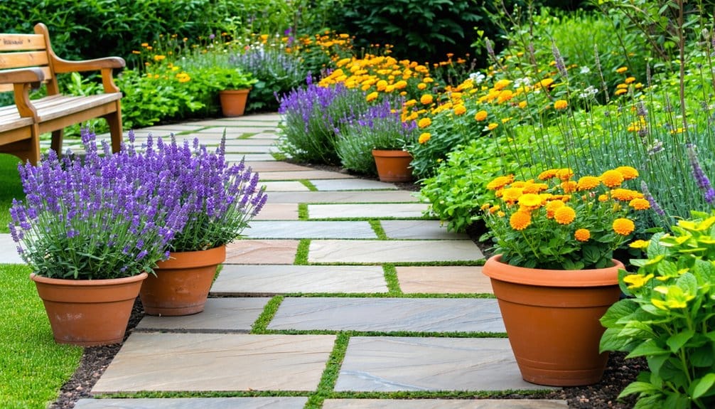
Beyond the interplay of colors, hardscape features play a significant role in reinforcing a garden’s focal points and enhancing color schemes.
These elements provide structure, guide the eye, and create contrast that complements plantings. Key ways hardscape supports color and focus include:
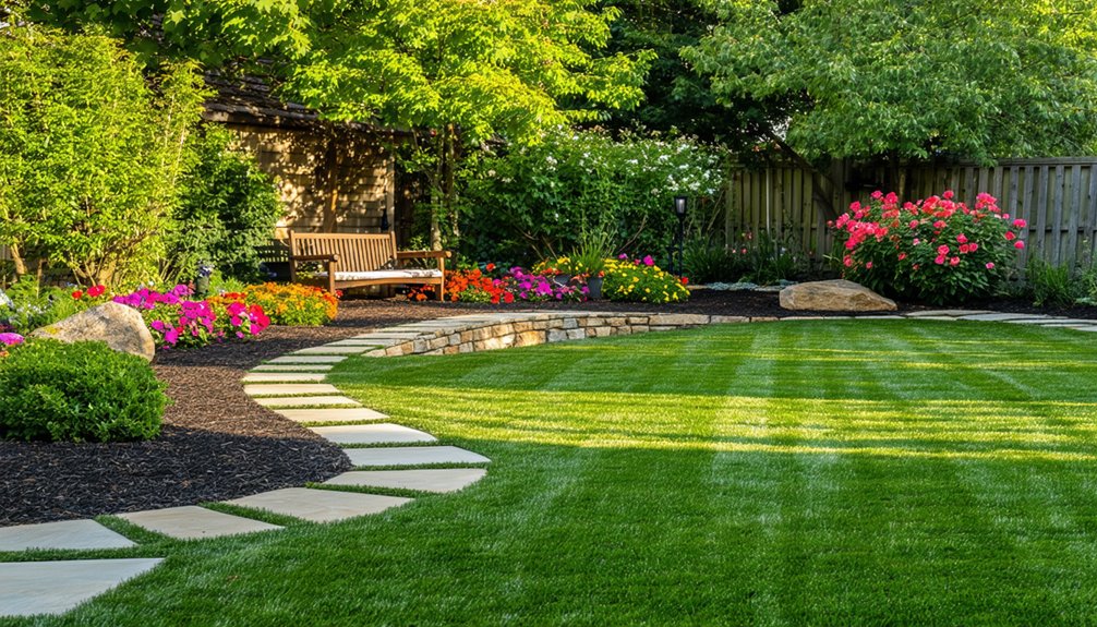
- Pathways and Edging: Defined paths and borders direct attention to focal plants and color groupings while adding texture contrast.
- Sculptural Elements: Statues, trellises, or water features act as visual anchors, emphasizing selected color zones and drawing the gaze.
- Seating and Containers: Benches and pots can introduce neutral or accent tones, framing vibrant plants and encouraging closer interaction with focal areas.
Seasonal Strategies for Maintaining Color Harmony and Focal Interest
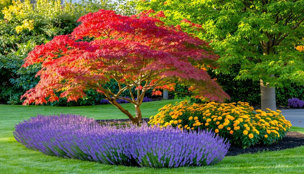
Since garden compositions evolve with the seasons, maintaining color harmony and focal interest requires deliberate adjustments throughout the year.
Garden designers employ seasonal planting schemes, rotating annuals and perennials to sustain vibrant color palettes aligned with each season’s mood. Strategic pruning and deadheading enhance focal points by promoting healthy growth and prolonging bloom periods.
Incorporating evergreen shrubs or structural elements ensures visual anchors during dormant months, preserving focal interest. Additionally, selecting plants with staggered bloom times guarantees continuous color transitions, avoiding visual monotony.
Garden lighting can be adjusted seasonally to highlight focal areas as daylight changes.
These proactive strategies collectively maintain dynamic and harmonious garden aesthetics, ensuring focal points remain compelling and color schemes cohesive year-round.
Conclusion
Mastering focal points and color harmony in garden design elevates both visual appeal and spatial experience. By thoughtfully selecting and positioning striking elements alongside complementary plant colors, designers create balanced, engaging landscapes. Integrating hardscape features and applying seasonal strategies further sustain interest throughout the year. Ultimately, a well-crafted garden achieves a harmonious blend of bold focal points and cohesive color schemes, guiding movement and enriching the environment with lasting beauty and dynamic charm.